
Google has been changing their search algorithm again. As of
April 21st, Google rolled out new Search Engine Rankings based on
whether a website is mobile friendly. Maybe you have received an email warning your
society website is not mobile ready. Maybe you have seen one of several articles
proclaiming search-ranking DOOM. But a few weeks into the new rules have you
even noticed a difference? Read on to see what Mobilegeddon really means for
the typical society website.
What it is…and is not
Google has changed its mobile
search algorithm to rank mobile friendly sites higher in search returns. This
does not affect your search rankings from the desktop browsers most of us use
while doing genealogical research. As a consumer, this a great step forward
towards a faster, easier search. Let me paint a picture for you:
I’m out at the park walking my dog. He chases a skunk into the woods. Out he comes both stinking to high heaven and covered in mud. I turn to my trusty phone to Google a groomer near me.
In this instance, having Google prioritize sites of local
groomers with mobile friendly websites I can actually read and use from my
phone would be a great help. But how many scenarios might you imagine where
your society website would be accessed in the same way? For most society
websites, the answer to that question will be none.
The niche advantage
Genealogical societies are unlikely to find their mobile search
engine rankings significantly impacted by the change even if their website
is not mobile ready. Our societies tend to be uniquely named. We have few, if
any competing websites for the typical search terms that lead users to us. Unless
you have the misfortune of a name such as “Oakville Genealogy,” Mobilegeddon
will not be a major concern. But that does not mean societies are off the hook.
The user experience
Knowing Mobilegeddon is unlikely to impact your society’s
mobile search ranking is not a reason to ignore mobile entirely. Our existing
society members are adopting mobile-based devices. The new, younger members
societies need to attract to stay viable expect to access websites designed to
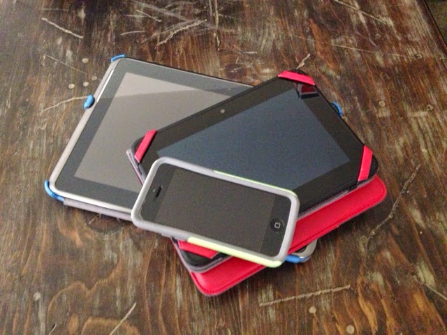
work on their latest gadgets. The smart phone is not the only mobile device to
worry about. Any App-based system such as Tablets and E-Readers count as mobile
devices. Is your website easy to use from these devices?
Most society websites will still be largely accessible from
mobile devices according to Thomas Ryder of EasyNetSites, a provider of society
websites used by many FGS members. While databases often prove difficult to
work in on the smallest screens, they are also the items least likely to be
accessed that way. However, one area of site design can cause user difficulty:
the spacing between navigation items typically found in the side bar of a website.
If the spacing is very close, it will be more difficult for mobile users to
correctly touch the navigation link they want from smaller screens.
From small adjustment
to grand plans
The quickest way to determine how user friendly your website
is on mobile devices is to test it out. Engage your society members to explore
your existing website on a variety of devices to see how it performs. Determine
what changes might be needed to make your existing site function better in a
mobile environment. If you’ve been tracking your website’s performance with
Google Analytics, you will be able to hone in on the sections of your site
accessed by mobile devices in order to focus any changes there first. It may
take but a few simple tweaks to make your existing site more robust for mobile
users.

However, many societies are in dire need of a website
overhaul. Too many have failed to update their site design from the earliest days
of site building techniques and technologies. If your society is contemplating
a fresh start to your web presence, building for the mobile future should not
be overlooked. Many mobile ready site builders are available from Weebly to
Wordpress. However site builders like EasyNetSites can be optimized to give the
best possible view from a mobile device even though they do not offer mobile
site building directly. It just takes a little forethought and planning.
Into the future
Mobile is not going away. In fact, mobile is set to expand
even farther with the push towards wear-ables such as the forthcoming Apple
Watch. While we may not expect to be doing much genealogical research from our
wrists, the days of the desktop as our primary working computer are beginning to
fade. Tablets, e-readers and smart phones allow us to work on our genealogical
projects at any time, from anywhere. Societies will need to stay abreast of the
latest changes in website design technology, search trends and computing tools
to give their users the best possible experience with their face on the web.

No comments:
Post a Comment